It seemed there was a lot of chatter surrounding gestalt in design last week.
The Nielsen Norman Group put out a series of 3-minute videos regarding Gestalt Principles in UI design (https://www.youtube.com/watch?v=DwR0SZTBMTU). The Interaction Design Foundation also ran a post featuring one of their courses on Gestalt Psychology in design. Many folks following these channels are making career moves into UX/UI/IxD from other disciplines. It would be easy for fundamentals of visual perception to be overlooked with so many other aspects of those disciplines to embrace. So, in this post, I will follow the trend. And, while pointing to further resources, I will also spill the beans with a primer on gestalt theory in design.
Indeed, gestalt theory is key to the fundamental principles and elements of design when it comes to visual perception. In fact, the German phrase for schools of “art and design” is “kunst und gestaltung.” It’s that central of an idea. Gestalt theory is also a part of popular culture perhaps due to its origins in psychology. For instance, the notion that one needs to get “closure” for a lived experience comes from Gestalt Psychology. (Closure being one of the principles.) Furthermore, the principle of “continuity” explains how we see our lives as a series of related and meaningful events, not discrete, unrelated occasions. More on Gestalt Psychology, if you are interested.
Gestalt Principles in Visual Perception
Parts-to-the-whole
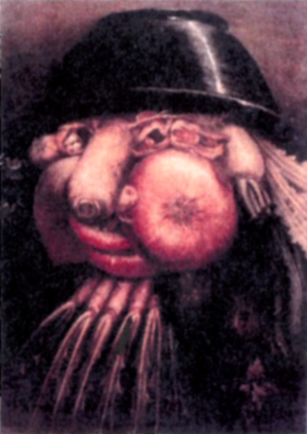
The over-arching principle of gestalt theory is an organized whole that is perceived as more than the sum of its parts, or “parts-to-the-whole” for short hand. Detectable parts such as the vegetables in the image below, are composed in such a way that a new image (that of a portrait) can be perceived. The whole portrait is understood to be greater than the sum of its constituent vegetable parts. The new whole arrives from the interplay of the constituent principles detailed later in the post.
There are many examples in our visual experience of this over-arching principle, the text you are reading right now come to mind as one of them. Through various arrangements of 26 individual letters, you can perceive whole words. Furthermore, the arrangement of those words form sentences, and so forth. Truly, this principle is all around us. If instead I type: ladfu nadsooaiop naleiuwenm aluieo dlowueirohifl jhadfueu, then you have no idea what I mean. In fact, those arrangements of letters are understood to be meaningless! I might just have to follow up on this phenomenon in another post.
For now, I’ll introduce the remaining principles and give an example of each. They are: Similarity, Proximity, Continuity, Closure, and Figure-ground. More recently, folks have introduced “Common Fate” to describe the grouping that occurs in our perception due to motion, or the perception of motion. I’ll pass on exampling that one in this post…but I want to acknowledge that you will find it out there included as a gestalt principle if you do your own digging around.
Similarity
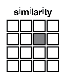
Similarity is perhaps the most immediate perceptual grouping. Namely, we group things we identify as similar. In fact, in order to detect difference, we must first detect similarity.
proximity
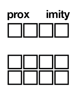
Proximity closely follows the immediacy of perceiving similarity. Things must share a perceivable spatial relationship in order to be understood as having any relationship at all. We then group similar things based on the proximity of them to each other. In the example below, two groups of squares appear to us based on the space between the similar shapes.
continuation
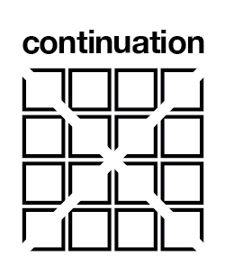
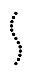
Continuation often involves creating alignments for the eye to follow and connect. In the first example below, an “x” shape appears by aligning the cut pieces of the squares in such a way that the eye can connect then “negative” space. In the second example, a wavy line can be seen composed among individual dots. Notice, proximity also plays a role in the composition. Likewise, figure-ground reversal is occurring in the first example. This is often the case with the gestalt principles. Many of them work together to create a new whole.
CLosure
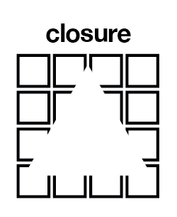
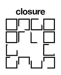
Closure involves alignments just as in continuation. Whereas continuation often results in rectilinear or curvilinear connections, closure often brings about the recognition of a new shape. In the example below, a triangle shape can be perceived due to the pieces removed from squares being aligned as such. The figure to the right shows the squares in disarray showing that in such a case the triangle is imperceptible. Note, the continuation and similarity work together in the broken closure example to still see them as sqaures!
figure-ground
Often referred to as “figure-ground reversal” this phenomenon of perception is what allows us to distinguish an object from its environment, as in a “figure” on a “ground.” This principle is often employed to create dynamic, visually compelling logomarks. In the example below. the white square and lines (along with the white of the page) can be perceived as both the ground upon which 15 squares are shown, or as a grid laid over a singular black shape. A simple example of figure-ground reversal.

In Conclusion
Years ago, I started a Pinterest board collecting examples of good gestalt at play in design. While I haven’t updated it in some time, it remains full of interesting examples of these principles at work. Who knows, I may even return to adding new examples. You can find that board at: https://www.pinterest.com/whatifwedidthis/good-gestalt/.
A nice primer on Gestalt Principles in design, one that includes “Common Fate” can be found at: https://www.toptal.com/designers/ui/gestalt-principles-of-design. This primer was developed for User Experience designers to consider.
Good use of gestalt principles can contribute to making meaning from and with the design artifacts you create. So, be sure to absorb as many examples of great gestalt phenomena as you can. Look for alignments in your designs and play them up, invite the eye and brain to generate more than the parts you place on a page or screen!
